Over the summer I completed a project that focused on bringing a newlywed couple's design styles together. He is very masculine, loves duck hunting, deep colors and wants functionality over anything. She is very feminine, loves all things to be light and airy, and just wanted their first home together to feel finished. They both have each other and their love for art and travel in common. Design wise that pretty much is all they had in common. My job was to pull both their styles together without favoring either side. To find a balance they both can live with till they find their permanent {larger} residence in a few years. They currently are renting a 2 bedroom condo in a great location. That means a lot of the finishes we could not change, but had to make them work on budget.
The sunroom/breakfast room was easy. He already owned the chairs and I simply recovered them in a simple linen. The table and rug was borrowed from the rental which came partly furnished. She had this suzani and I had it framed to make a huge statement. This room I would say airs more on her side of design.
The kitchen was white on white on white. It could have been worse, but they both like color. I used an outdoor blue and white runner on the floor and simply added a collection of antique plates she owned and added a few accessories just for a touch of interest without going overboard. The runner is great for kitchens. It can just be hosed off!!!
The table, chairs, lighting, and mirror all came with the rental. I found this to be ample opportunity to display some of their growing art collection. I hung the pieces on the mirror with 3-M hooks. It made a room they once hated into a room they can easily enjoy.
The bar was easy to fill with both his and hers glass collections. I just made it look good.
The living room is a mix of new and what they already had. I came in with new chairs, sofa, pillows, jug lamps, and ottoman. Everything else is their's. I am hoping once they are in the market for a new rug then something like this would be chosen. It would really lighten up this room some more and make it really shine! She really likes florals so I choose pillows with a deep brown more graphic floral to make them slightly more masculine to suite them both.
The table and chairs came with the rental and she had this great bookcase. We decided to make it a sort of library and another place for him to study during his residency. Again I used the accessories that they had and was able to pick this floor lamp for someone to buy them as a wedding gift. There is no overhead lighting in this area. They love the more Spanish style and travel often and of course come home with goods every time.
They owned everything here too. They needed a spot to drop keys and such when they came in. It's a sort of make shift entry where there wasn't a defined space. The baskets provide great storage which was much needed.
The 1/2 bath is small and all white. It fell flat with the not so great finishes. I added texture through accessories and the antique mirror was layered to add interest and depth. Yes, it could be hung lower, but alas that thing is heavy.
You may have seen this space before when I featured a completely budget friendly art wall. This is the guest/office space. The other side of this room houses a desk and such. This is her old daybed and he wanted the space to house the fun ALABAMA pillow. The rest I added to make it all work together.
In the guest bath I tried to carry the warmth from the bedroom into here and also added some more bird prints over the commode.
The master they both wanted to be a soothing space. Although the bedding is a neutral it had a great pattern/texture that kept it from falling flat. The headboard he had and I recovered it in a neutral linen. The frames I hung to house wedding pictures in which they would hang everywhere if they could. Not such a bad thing since we were their photographers too. HA. These are photoshopped in, but you can get the idea.
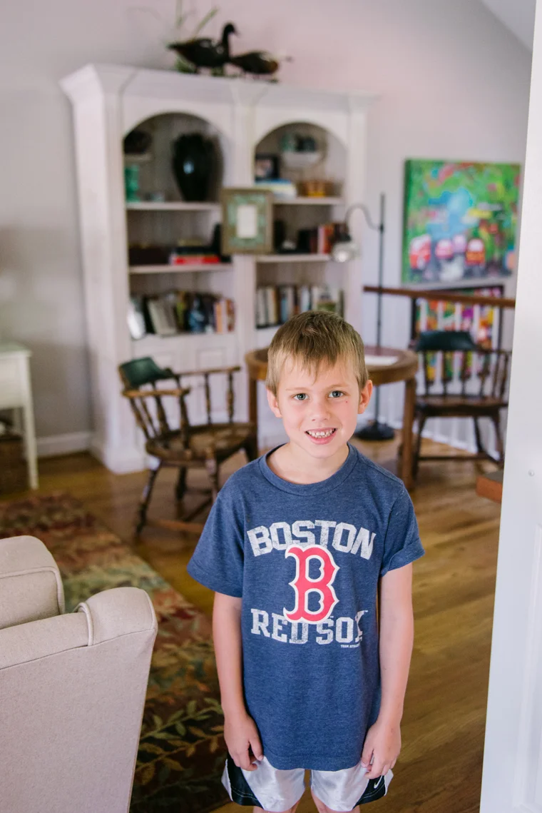
While Ellie was at horse camp this little man was my partner in crime. He spent days unwrapping everything, installing, and cleaning up after my mess. He also had a keen eye for when I did something he did not like or placement of objects.
I would say overall this was a study on home styling. The big living room pieces were new, but the rest was just adding the fluff and making what they already owned cohesive. Although it is fun to start all new on occasion most of the time budget doesn't allow that and a good fluffing is all it needs. The perk of this home was that I got to move them in and place every object where I thought fit for space and flow. They had no preconceived ideas and were at a lose on how to make their stuff work together so that's where I came in.


