HOME TOUR: kitchen + family room

When people ask what I do I sometimes tend to hesitate. Over the years I have done many things. Currently I do many things. I am a freelancer who fills the need where it is needed. It all revolves around design in some way or another. Whether it is designing a room, making a corporate area speak to those who are within its walls, photographing interiors or photographing weddings. Need help organizing? I love to do that too. I have always been a very visual person and love to observe spaces and people around them. I am sure some dr would tell me it stems from being dyslexic as a child and having trouble reading, writing and communicating. I would say it's a gift that God gave me and maybe that gift wouldn't have been realized if I didn't have that time to train myself to communicate differently when I was small. I drew, I created, I had rainbows painted on my walls. Creating always helped clear my mind. That is why during this season I can add blogger back to my long list of 'what I do'. 

This home I had the pleasure of capturing for Slate Barganier, a local building company that creates some of the most exquisite homes. Upon walking in, this home immediately filled me with awe. It filled all my senses. The home exuded peace and the sense that this was a place for family and friends to truly gather. Every detail was thought out and executed beautifully. The best part, the kitchen reminded me of mine once it grows up. Maybe that is why this house immediately felt like home. The sweet pups didn't hurt either. Today I am just sharing the family area. I am sure I will share the rest one day too, but this is the area I wanted to curl up in with a good book after eating a hearty meal. The area where they hang most. Where life happens. The kitchen, eat in area, and the family room that was surrounded by glass hence making it my favorite space ever. I hope this home captures one of your senses whether visually, through a feeling or even just a piece that speaks to you. 

KJP (18 of 104).JPG
KJP (12 of 104).JPG
KJP (5 of 104).JPG
KJP (1 of 104).JPG
KJP (20 of 104).JPG
KJP (22 of 104).JPG
KJP (23 of 104).JPG
KJP (26 of 104).JPG
KJP (28 of 104).JPG
KJP (24 of 104).JPG

kitchen re-do on a budget...

I can not even believe that this post is actually happening. When we bought this house I knew that the kitchen had potential for a quick and budget friendly fix. In the end it ended up not being so quick, but it was budget friendly. It took us about 6 months to get this far and I am actually glad that we took it a little slower so I had time to mull it all over. You can see where it started here and the second phase here, and then the third.

This West Elm table used to serve as our desk in our old house. The black and wood chairs are still a favorite of mine from Industry West. the legs are just oh so pretty. The cesca chairs were a craigslist find for our old dining room. The floors still need to be refinished or changed all together, but that fits into a not so budget friendly future project.

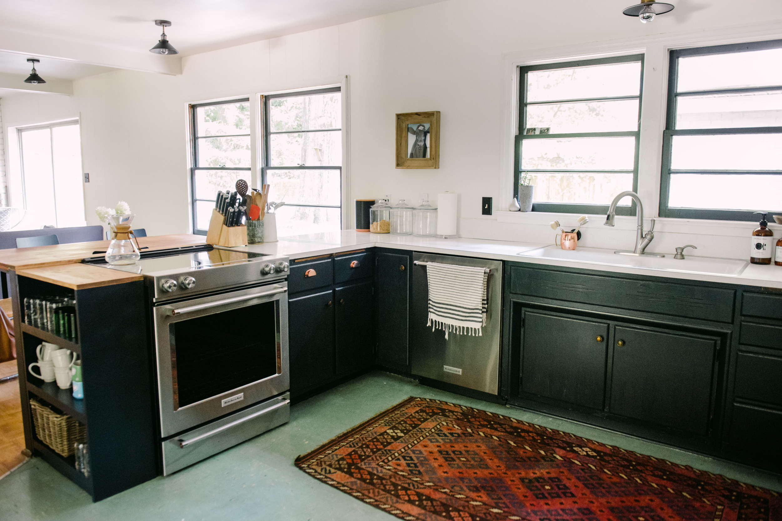
Can you believe I almost painted the hutch Alabaster white to blend it in with the walls? This is where taking our time really paid off. I am pretty much obsessed with the way the inky black paint shows off the copper. The original rippled glass is a favorite of mine.

The knobs and hinges are original to the house. I changed them out for copper bin pulls that I found for $2.00 a piece on amazon. Unfortunately they haven't been restocked in months. You can see the old laminate here. From a distance it just looks white, but up close it has swirls. Ack. Part of me wants to try the concrete over lay that I first saw here, but wonder about longevity. Anyone try it before?

This used to be all closed storage and once we had it painted out I realized I like it better without the doors. It shows off our everyday plate set and my grandmothers ironstone. The bottom to cabinets we ended up closing off for the kiddos snacks. I added two bin pulls here to mimic big drawers. To the left is our open laundry room area. That is for a whole other post though.

The green floors don't bother me as much now that everything is dark. We may do something with them this fall, but then again maybe not. So many projects and so little time and it all adds up financially pretty quickly.

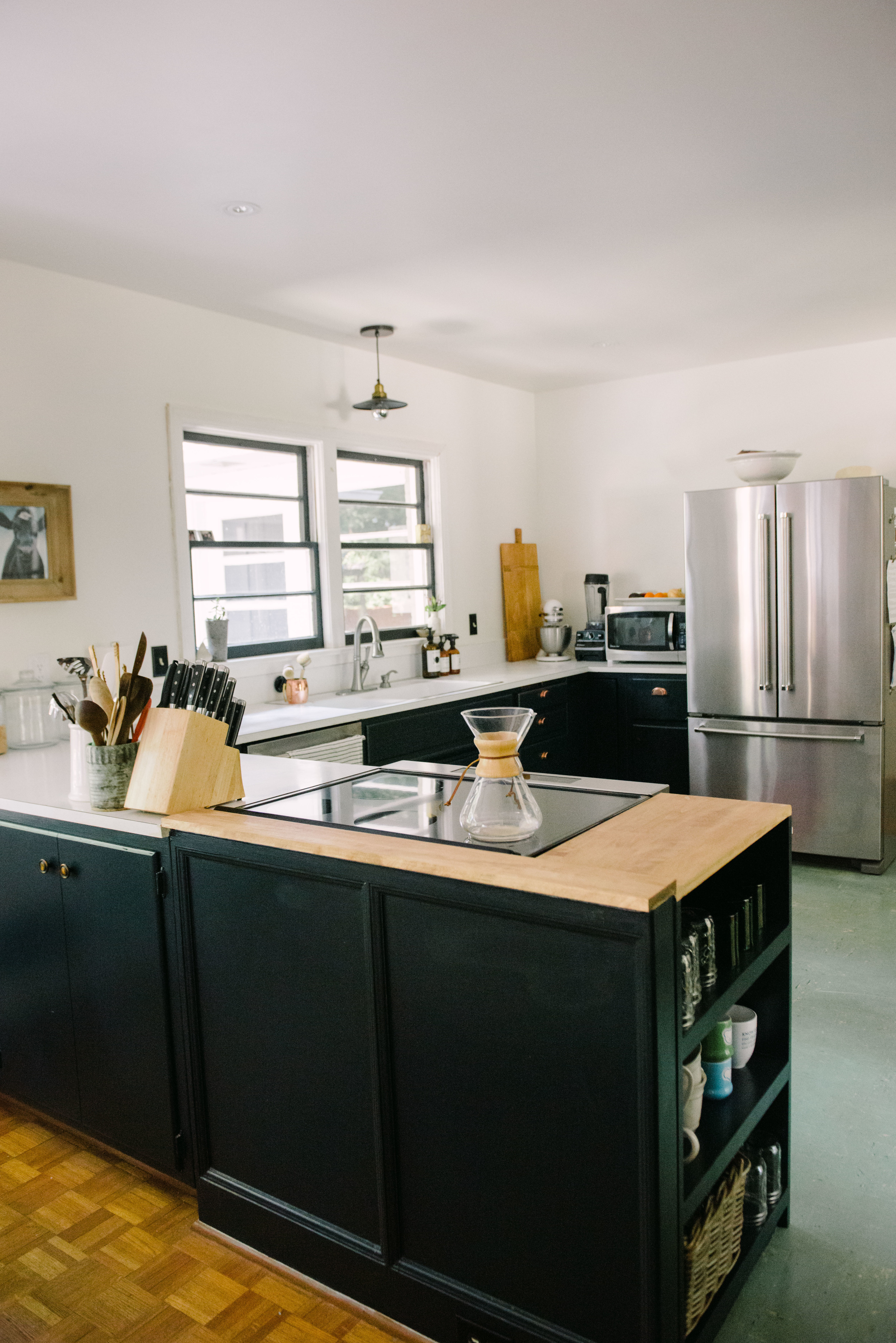
The appliances are new. Our fridge went out and then the panel on the front of the dishwasher fell off all in the same week. It was Memorial Day weekend so we shopped around a bit. Kitchenaid was having a huge sale at Lowe's plus we had a 10% off coupon so we went ahead and bit the bullet. They really were the catalyst on finishing off the kitchen. I wish I had somewhere else for the microwave and blender, but for now we do not. We use them everyday so I prefer to have them both in plain sight. I also want to add either art or a collection of stag horn ferns to the left of the fridge. Still mulling that one over though. I would also love to add either this or this for our knives to get a little bit more off the counter. Again still mulling.

If you recall the original stove was huge and once we switched it out it left a huge gap. We had this made by the same friend who made our modern firepit. I love the extra storage it provided, helped make the kitchen look more finished, and provides safety from the stove.

Of course our cow print made it into this kitchen too. Our original plan for this kitchen is to make it good enough for a few years then re-do it completely. Currently I am so happy with this space I am so tempted to change out the counters to a stone and call it a day. Can't tell if it's my slight project burn out talking though.

SOURCES: wall color sherwin williams alabaster | cabinet color farrow and ball railings matched by SW in an oil base | overhead lights | sink light {similar} | slipcover on restoration hardware sofa | black chair in dining room | table {similar} | cesca chair {similar} | copper bin pulls {similar} | everyday plates | rug | cow print | glass canisters | black canister {similar, similar, similar} | towel holder | blender | tote bag | chemex | mason jars  | mugs | serving bowl on fridge

KITCHEN PROGRESS

My day is filled with touch up paint and putting this mess back together. The Mr surprised me with starting the massive project of painting the built in cabinet in the kitchen to match the rest of the cabinets I finished here. The built in's act as a pantry for us so I have been taking extra care in not only making it pretty, but also making it functional for the long haul. You are also getting a peek of our new kitchenaid appliances and did you notice the little glass partition has been removed too? I am so excited with the progress and can't wait to share the final outcome. Well, I am actually most excited about having a final outcome in general. After this we are taking a pause till fall on house projects. Easier said than done for someone like me though. Ha.

PAINTING: Farrow and Ball Railings color matched my Sherwin Williams in Color Accent semi-gloss oil based paint. Oil base was not my first choice as I really wanted to go with the actual farrow and ball paint, but the previous owners used all oil base paint and I did not want to put the effort into sanding it all down, priming, then having to paint again as this is not our forever kitchen. Although I can honestly say I am kind of loving it as is now.

ORIGINAL KITCHEN  | KITCHEN PHASE ONE | KITCHEN PHASE TWO

PS: Serena and Lily is having their big Tag Sale and my favorite baskets that are in our living room are on a HUGE sale. I have these and these!