Last week I received the below question and thought maybe a few of you may like to know my thought process behind some of our decisions too. Over the years I learned that every design decision should have a clear cut reason behind it. If not I tend to tire of it easily, but if I have a purpose behind said design choice it seems to have longevity. Am I weird? Maybe so, but I'm so okay with that. Ha.
{reader} My question is: was the decision to keep it the same {paint color} a design choice or a time choice? I think it looks great in your place but I'm wondering if you're happy with it or do you plan on painting the trim later?
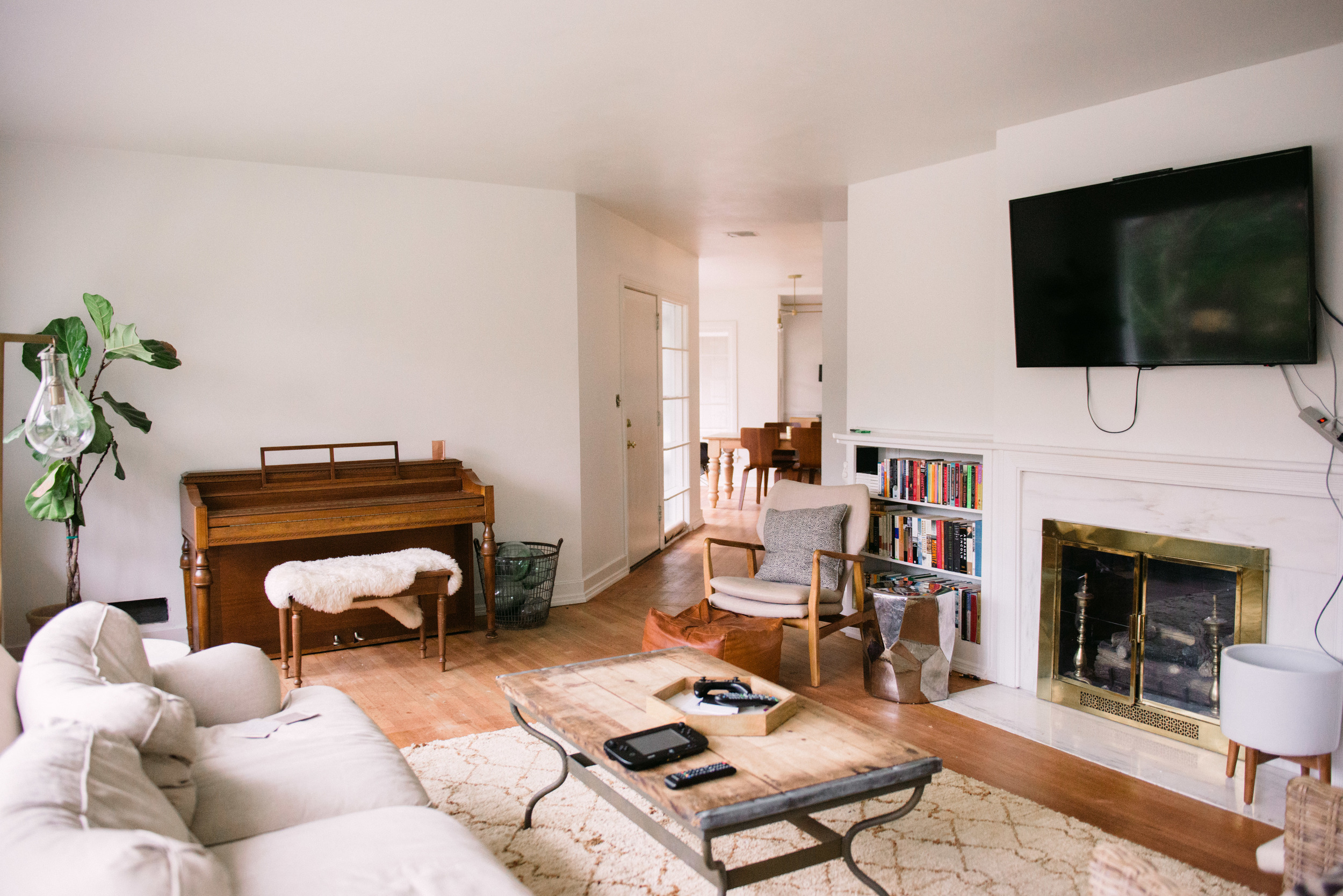
The above room is from our new house when we just moved in. It's "un-decorated" but all the major key players are in place ready to be brought to life again. Before we moved in we painted all living areas Sherwin Williams Alabaster. That included the walls, ceiling, and trim. We tried about a half dozen different whites and this was the clear winner. We get an incredible amount of natural sunlight so many of the whites tried to turn blue or gray. Alabaster has a slight yellow undertone that keeps it feeling warm.
Now back to the question... I knew before even buying this house that it needed to be all one color. It is a mid-century modern ranch and I wanted to stay true to the modern feel. Painting a space one color automatically leans towards a clean and modern look. Of course this mostly only works with white unless you are gusty enough to have a colored ceiling which I am not. I wanted the space to feel light and airy which white accomplishes easily. Why I did not do the standard ceiling white was a design choice that proved to be practical also. The slight yellow undertone that makes this white warm does not read as yellow because there is not a another white to compare it to. If we did the standard ceiling white and had it join the Alabaster walls then you would see the blue undertones of the ceiling making the walls look more creamy which I did not want. On the practical side it also made painting easier because we had no lines to cut in.
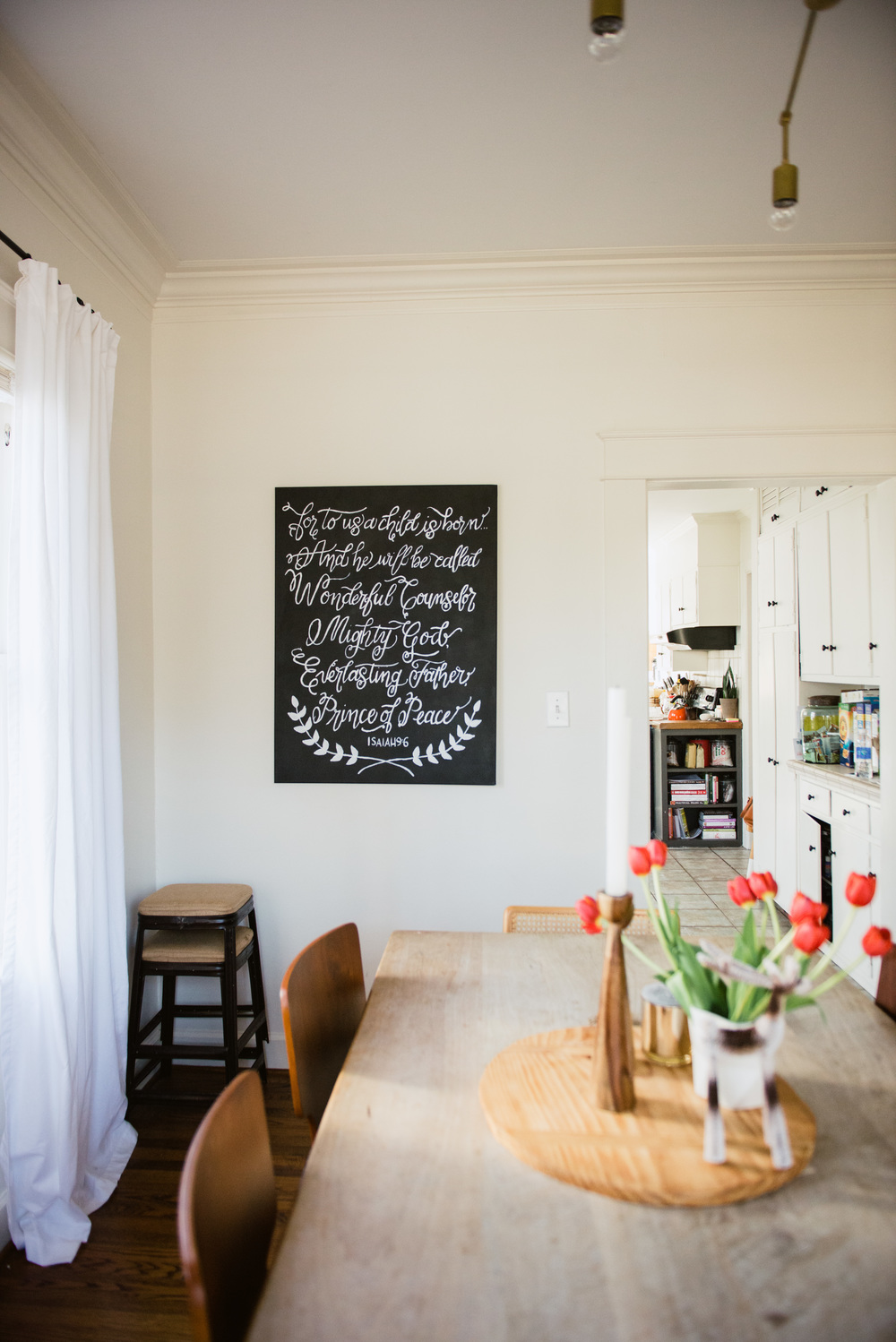
Above is from our rental were we were able to paint the walls, but not the ceilings. The ceilings were a standard ceiling white and the walls were Martha Stewart Talc from Home Depot. As you can see the "white" of the walls read much more creamy because they were up against a very white ceiling. Boo. Over all it did not kill the look though because in a 1931 craftsman house a clean and modern look was not needed. This house was meant to have character and tons of it.
This is our home from the beginning of my blogging days. Sorry for all the tags, but I had to take it off the Houzz tour I had way back then. We bought this home as a new build. They gave us three choices to paint the walls and this was the closest to not brown they had. It was Sherwin Williams Rice Grain. Once we moved in we painted the trim and doors Sherwin Williams Mega Greige which is still one of my all time favorite colors. I choose to have dark trim here to add some character to the new build. This house was almost too perfect and I wanted to add some age to it so this was the easiest and cheapest way to accomplish it. Later I did end up painting the whole house white which you can see here.
Let me know if you have any "whys" and I would be honored to answer them! Of course everyone's design methods are different, but would love to share what has worked for me. I truly believe everyone should have a home they enjoy regardless of budget.


